


Instead of intellectualizing why simplicity is cool, let’s look at some sites that prove it. Here is a list of simple websites that showcase the elegance of simplicity.
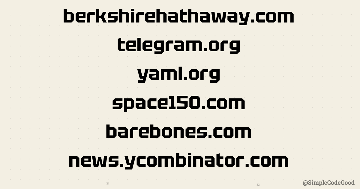
https://berkshirehathaway.com/ — the conglomerate that has enough money to buy half the internet hasn’t veered from its 90s aesthetic of blue font and direct links.
https://telegram.org/ — A consumer messaging app that doesn’t try too hard. The combination of simple text and whimsical rubber ducks is eye-catching without being try-hard. If one of the top 5 most-downloaded apps in the world can get away with this, so can you.
https://yaml.org/ — A site that’s structured to mirror a real YAML document. A great example of how to break out of the generic WordPress or technical doc site layouts.
https://www.barebones.com — a 34-year-old text editor that “(still) doesn’t suck.” The site is clearly written by a cowboy indie developer who doesn’t care what the cool kids in the valley think.
https://news.ycombinator.com/ — it’s amazing how much use they’ve gotten out of this simple hyperlink + feed concept. Their commitment to the chronological feed is what keeps me coming back.
https://www.space150.com — an agency that proves that simplicity doesn’t need to be old-fashioned. A lot is going on, but it’s controlled and well-structured. They redo their website very frequently, so revisit this site in a few months for another variation of elegant simplicity.
Whenever I’m tempted to restyle a landing page (again), I revisit these. Before long, I usually conclude, “Ya know what, I kinda like it how it is.”

More
Rich Siegel interview (substack)
Rich Siegel explains how he works (usethis.com)